ProPhoenix Alert App
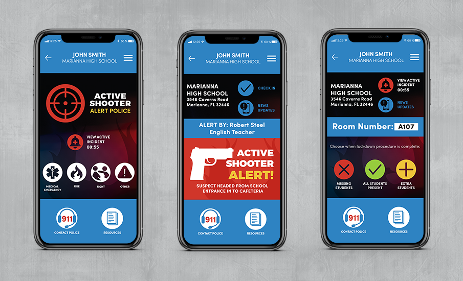
When a crisis unfolds at a school, timely response and correct, ongoing communication between the school and law officers are essential. ProPhoenix’s newest development, the Phoenix Alert App, was designed to keep officers and faculty informed, and to keep everyone, especially students, safe. Idea Lab was tasked with delivering a modern user interface (UI) complete with custom icons, to achieve a consistent, professional and effective user experience. The size, style and placement of each icon and the hierarchy of each screen was deliberately thought through and executed for threatening instances, such as an active school shooter. The end user’s safety is dependent on quick, effortless interactions with the app, so we structured our UI design around clarity during a time of panic and danger.

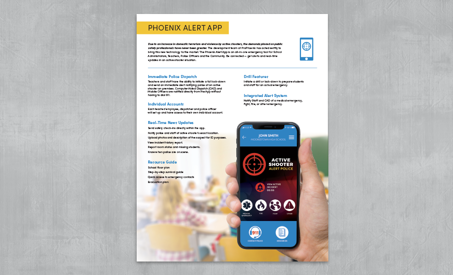
In addition to the Alert App UI design, ProPhoenix also hired Idea Lab to write and design a one-page Sell Sheet to introduce this innovative product to the market. We kept this piece seamlessly consistent with the layout style we created previously in ProPhoenix’s brochure and website, and intentionally geared the design and content around a school teacher’s point-of-view: one of the most common and important users of the app.
Client: ProPhoenix, Inc.
Project: Mobile App UI Design